Domino’s Pizza App Redesign
February, 2020

Domino’s Pizza App Redesign
This was a personal project for me. Domino’s pizza is an app that I often use personally to make my orders there, I usually don’t make orders over the phone. I find the app easier. But it’s very old looking and not really easy to navigate. It’s very text based, there aren’t enough visuals and I think it would be more inviting and appetizing if there were more visuals. So that’s what I set out to do, modernize the look and feel of the app, add more visuals and micro-interactions.
So Soft UI, or Neumorphism was trending when I started on this project so I thought why not take a jab at it. It took me a while to get it right, I kept looking at a lot of Soft UI designs and looked closely at the lights and shadows and the colors and spacing between the elements which I found was very important. Elements in Soft UI need to have a lot of room to breathe and not feel crowded, and I thought that using off-white and bright colors would really help give it that spacious feeling.
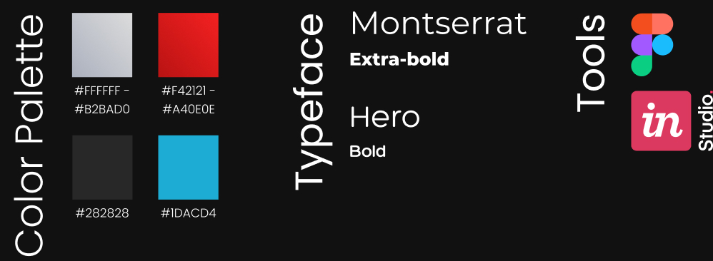
This was the first time I made a prototype using InVision Studio. I used to illustrate interactions of how the app works with Adobe After Effects. But making prototypes I think is much more functional because the user can actually interact with the product and you can conduct user research on it unlike a video that only illustrates how the app is supposed to work, and it’s less time consuming as well.